Case Study: Porch (again)

Intro & role
TL;DR: Produced a 400% purchase conversion improvement (and tracking continued progress) with homepage and funnel redesigns focused directly on conversion.
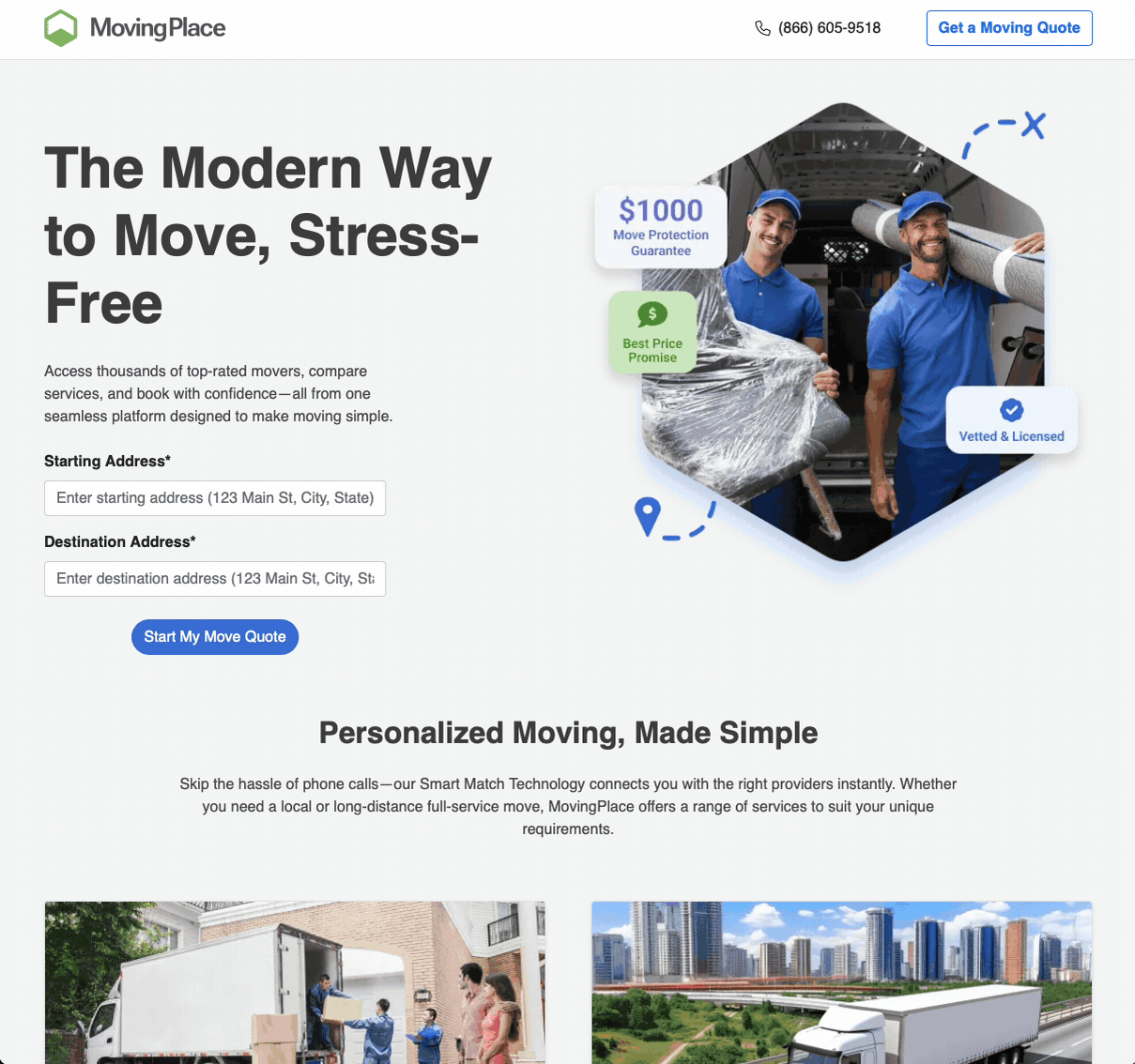
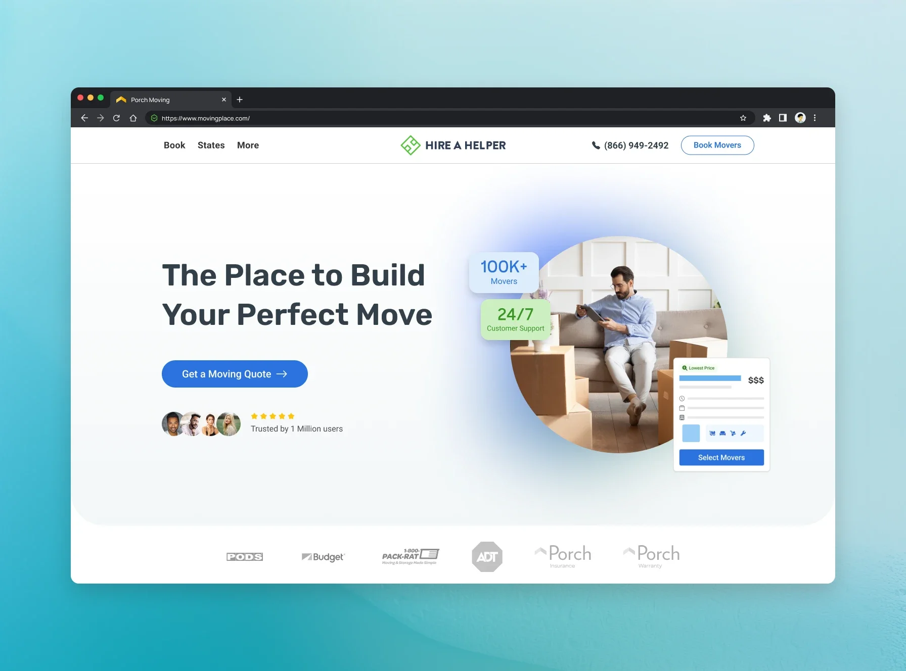
MovingPlace is Porch’s commercial moving experience, and this initiative was focused on one thing: dramatically increasing purchase conversion by simplifying the quote and booking journey. I led the product work end to end, partnering with design, engineering, and operations to remove friction, tighten the flow, and make pricing and next steps feel obvious instead of intimidating.
Context
Commercial moving is high intent, but it comes with higher stakes and less patience. Users show up trying to solve a real business problem fast, usually under pressure, and they want immediate clarity on two things: “Can you handle my move?” and “What is this going to cost?” If the funnel feels vague, long, or overly complicated, they abandon it and go elsewhere.
This redesign was built to reduce uncertainty, lower cognitive load, and move users from interest to purchase without forcing them to fight the process.
Problem
We were losing too many users before they ever completed a quote or made it to purchase. The biggest issues were classic conversion killers, amplified by the commercial use case:
Too many steps and too much effort up front
Users weren’t sure what would happen next or how long it would take
The experience asked for heavy information before establishing trust and value
Pricing expectations were unclear, which created hesitation and drop-off
The overall flow felt longer and harder than it needed to be for a high intent customer
Goal & key metrics
We optimized directly for conversion and progression through the funnel, with an emphasis on making the path to purchase feel faster and more predictable.
Primary KPIs:
Purchase conversion rate
Funnel step-to-step completion rate
Drop-off rate at key steps
Time to quote and time to purchase
Return rate and continued-progress completion (users who left and came back to finish)
My role
In this initiative, I led the work end to end, from defining the KPI and success metrics through discovery, prioritization, design iteration, development, QA and UAT, and launch. I partnered closely with design, engineering, marketing, operations, and partner teams to keep the work aligned and shippable on a tight timeline, and I owned the tradeoffs on scope and sequencing so we stayed locked on conversion impact. I also helped define the operational workflows behind the UI, including pricing logic, vendor routing, and the handoff between customer actions and fulfillment, so the experience matched what the marketplace could actually deliver. Post-launch, I leaned hard on reporting to see how users moved through the funnel, where they dropped, and what broke in the flow, then used those learnings to iterate quickly.
Team
Head of Product (Me)
Junior Product Manager
Senior UX Designer (Design Lead)
Junior Designer
Illustrator
Project Manager
Full stack development team
The problem (commercial is different)
Commercial moving users are typically:
Higher urgency
More price sensitive
Less patient with vague steps
More likely to require confidence before they commit
The funnel needed to feel simpler, faster, and more transparent.
Key improvements
Simplicity: fewer steps and cleaner decision points
UX best practices: tighter flow, clearer progression, better form patterns
Reduced cognitive load: less reading, fewer choices per step, clearer defaults
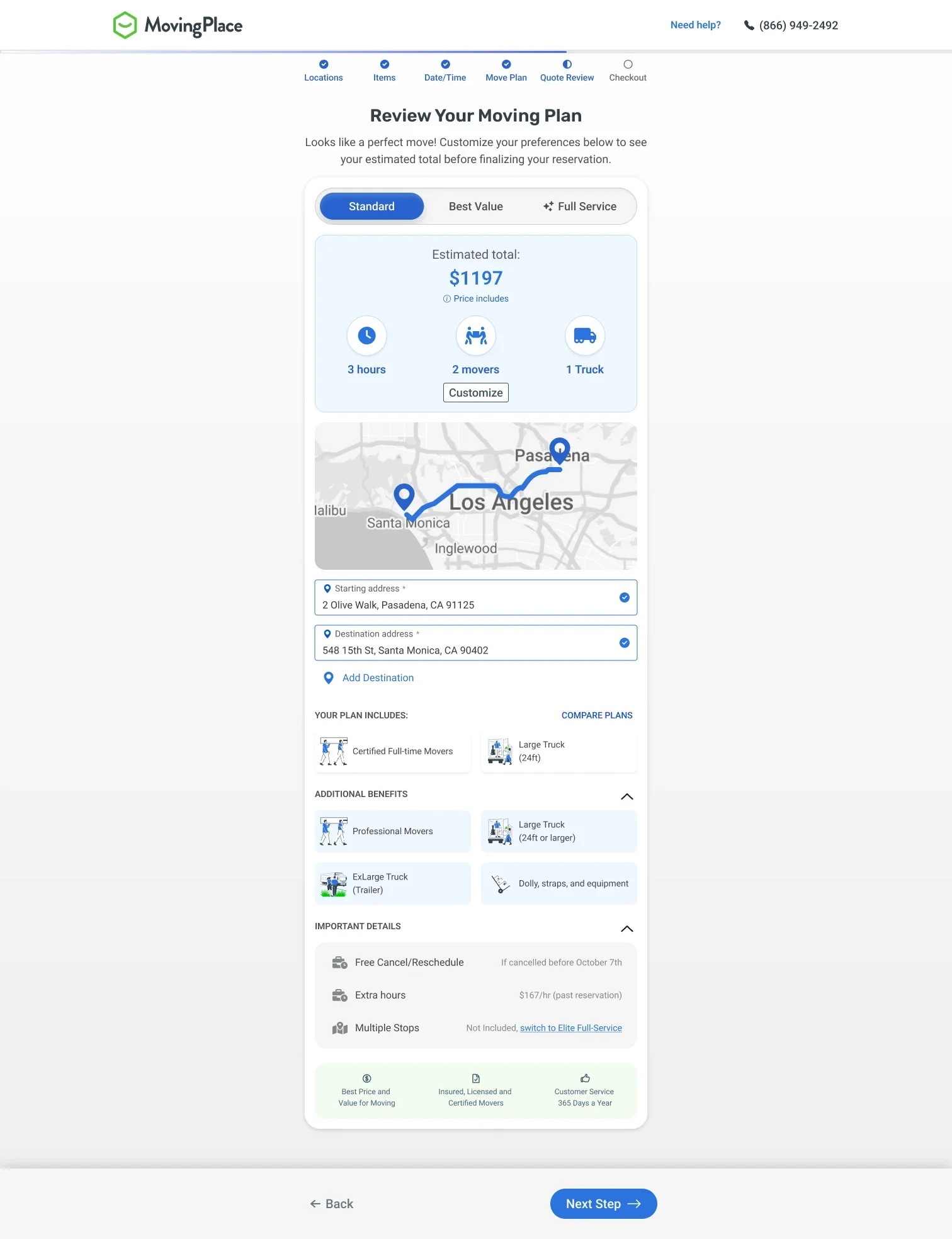
Price transparency: stronger expectations and fewer surprises
What we changed (high level)
Restructured the flow to reduce unnecessary steps and questions
Improved step sequencing so users provide re-targeting data questions first
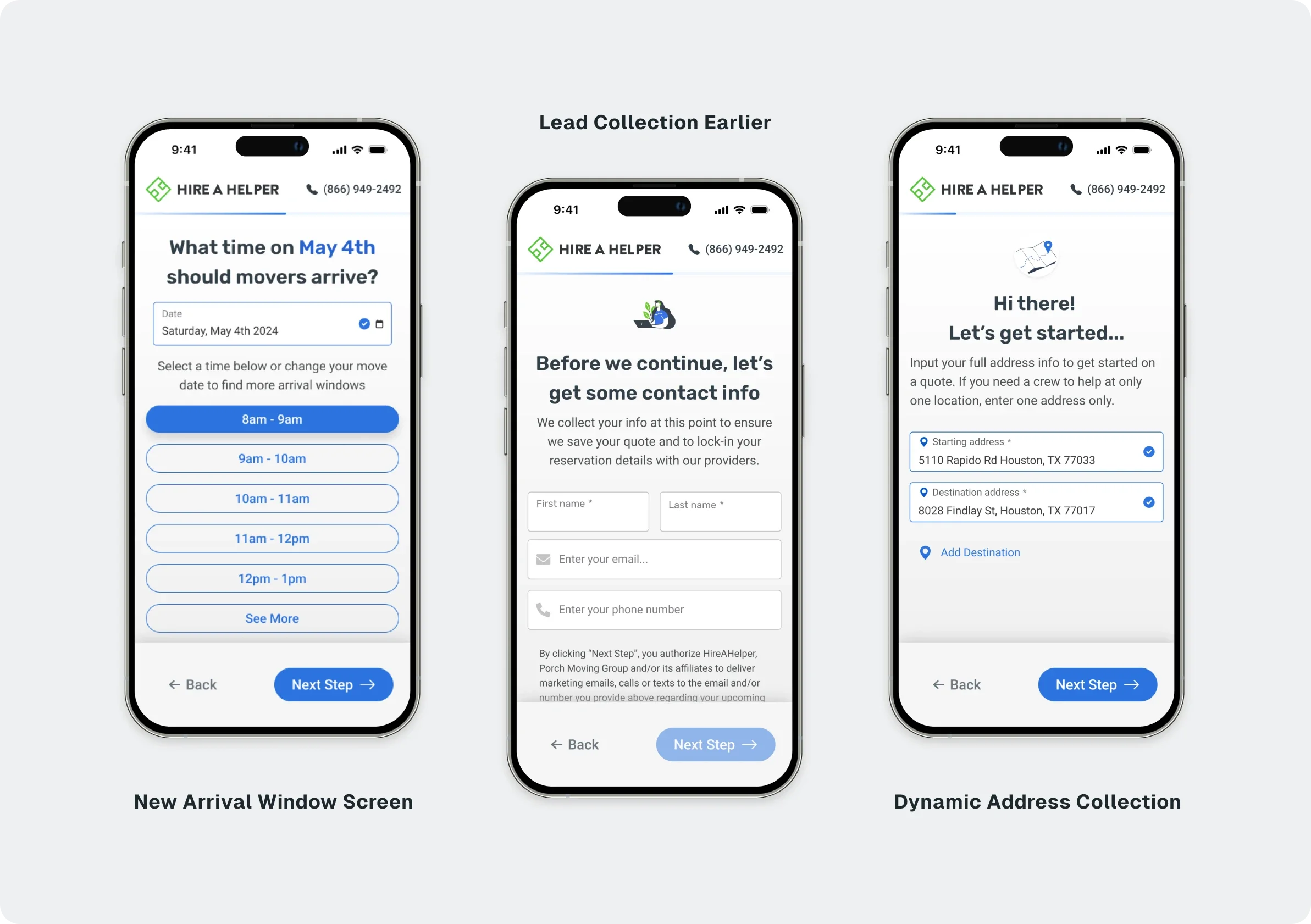
Simplified language and reduced “marketing speak” inside the funnel
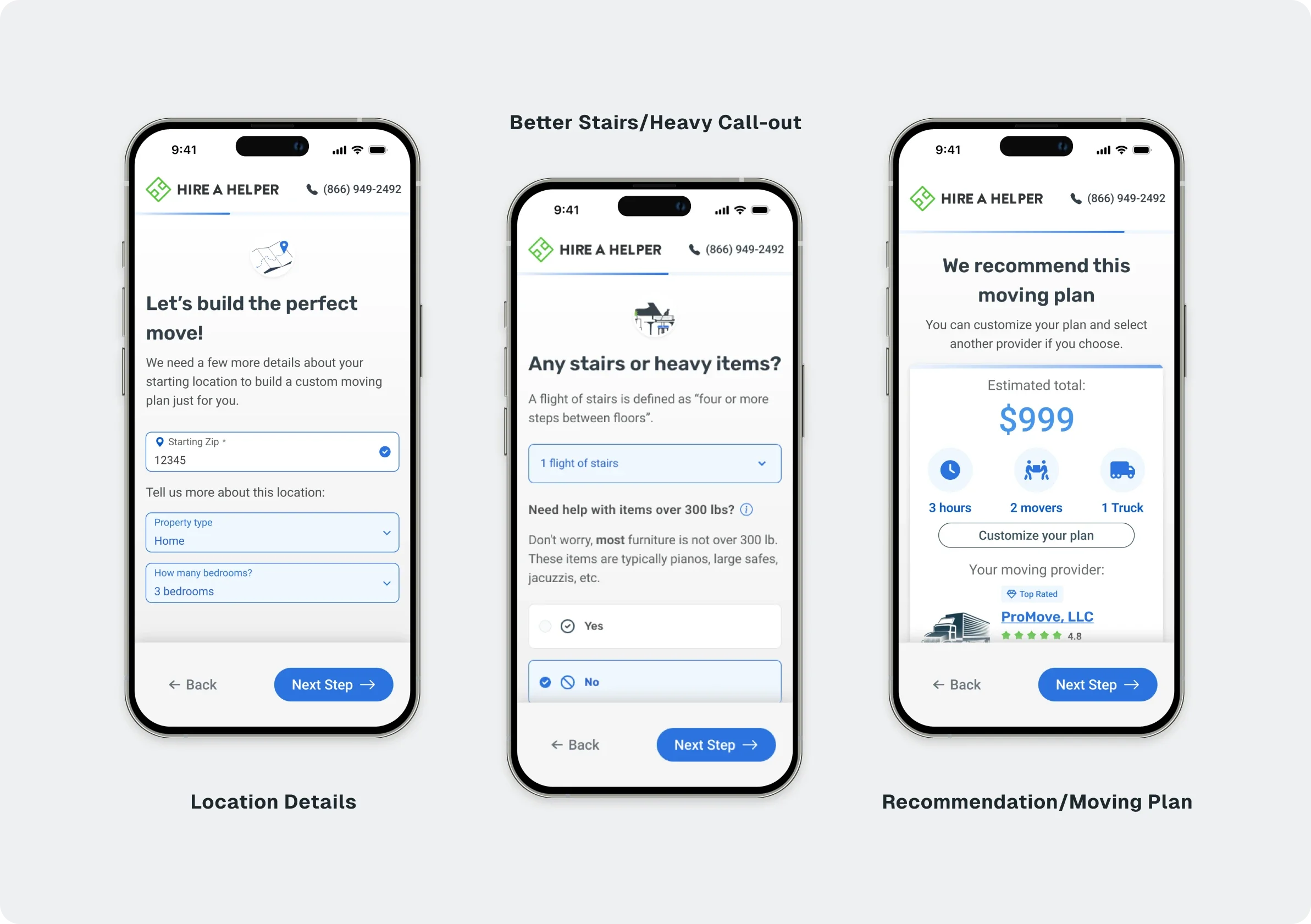
Increased transparency around cost drivers and what impacts pricing
Outcome
400% improvement in purchase conversion
Stronger ability to track and retain users as they progressed through the funnel
Clearer user understanding of what they were buying and why it cost what it cost