
Case Study: Porch
Context
TL:DR: We redesigned the homepage and it resulted in a 200% increase of consumer intent, which led to a 130% increase in conversion.
Moving is high stress and high intent, but the UX often does the opposite of what the user needs. People show up wanting one thing: “Can you help me, and how much is it going to cost?” If they can’t answer those quickly, they bounce.
These projects were designed to remove confusion at the top of the funnel and create a cleaner, faster path to quoting and booking.
Problem
We were losing too many users before they ever entered the funnel or made it far enough to buy.
The biggest issues were classic conversion killers:
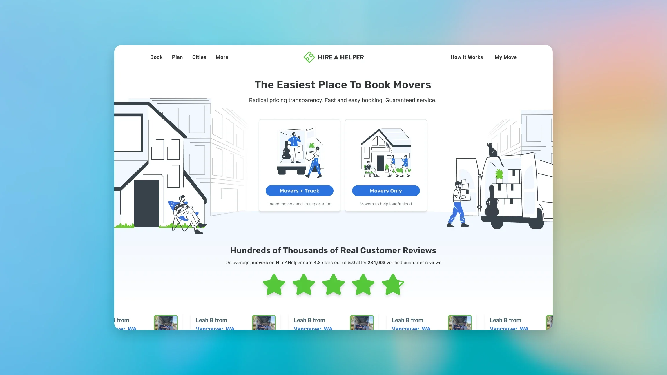
The homepage didn’t clearly communicate the value proposition fast enough
Users were unsure what to do next and what would happen if they clicked
Too much cognitive load up front
Pricing and expectations were not transparent enough
The funnel felt longer and harder than it needed to be, especially for commercial moves
Goal & key metrics
We optimized for two things:
Intent: more users starting a journey from the homepage into the purchase funnel
Conversion: more completed purchases once users enter the funnel
Primary KPI:
Homepage click-through into funnel
Funnel step-to-step completion
Purchase conversion rate
Drop-off rate at key steps
Time to quote and time to purchase
Summary
Delivered a 200% increase in consumer intent through a redesigned homepage with clearer value props, improved structure, and enhanced aesthetics. The refresh roughly doubled the number of users beginning their journey and entering the consumer funnel.
My role
In this initiative, I led the work end to end, from defining the KPI and success metrics through discovery, prioritization, design iteration, development, QA and UAT, and launch. I partnered closely with design, engineering, marketing, operations, and partner teams to keep the work aligned and shippable on a tight timeline, and I owned the tradeoffs on scope and sequencing so we stayed locked on conversion impact. I also helped define the operational workflows behind the UI, including pricing logic, vendor routing, and the handoff between customer actions and fulfillment, so the experience matched what the marketplace could actually deliver. Post-launch, I leaned hard on reporting to see how users moved through the funnel, where they dropped, and what broke in the flow, then used those learnings to iterate quickly.
Team
Head of Product (Me)
Senior Designer
Junior Designer
Illustrator
Junior Product Manager
Frontend development team
Timeline
1.5 months end-to-end
2 weeks dev time (1 sprint)
UAT: 3 days
What we learned (and what guided the design)
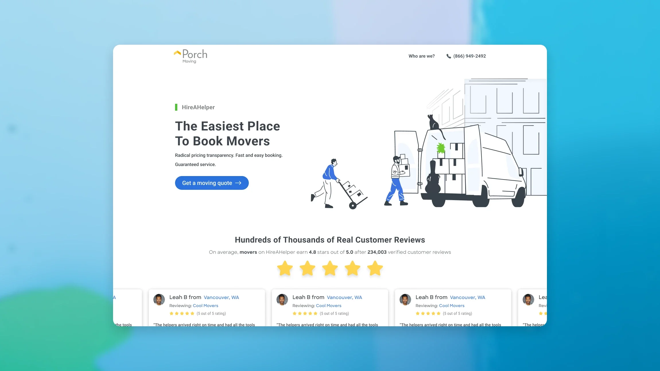
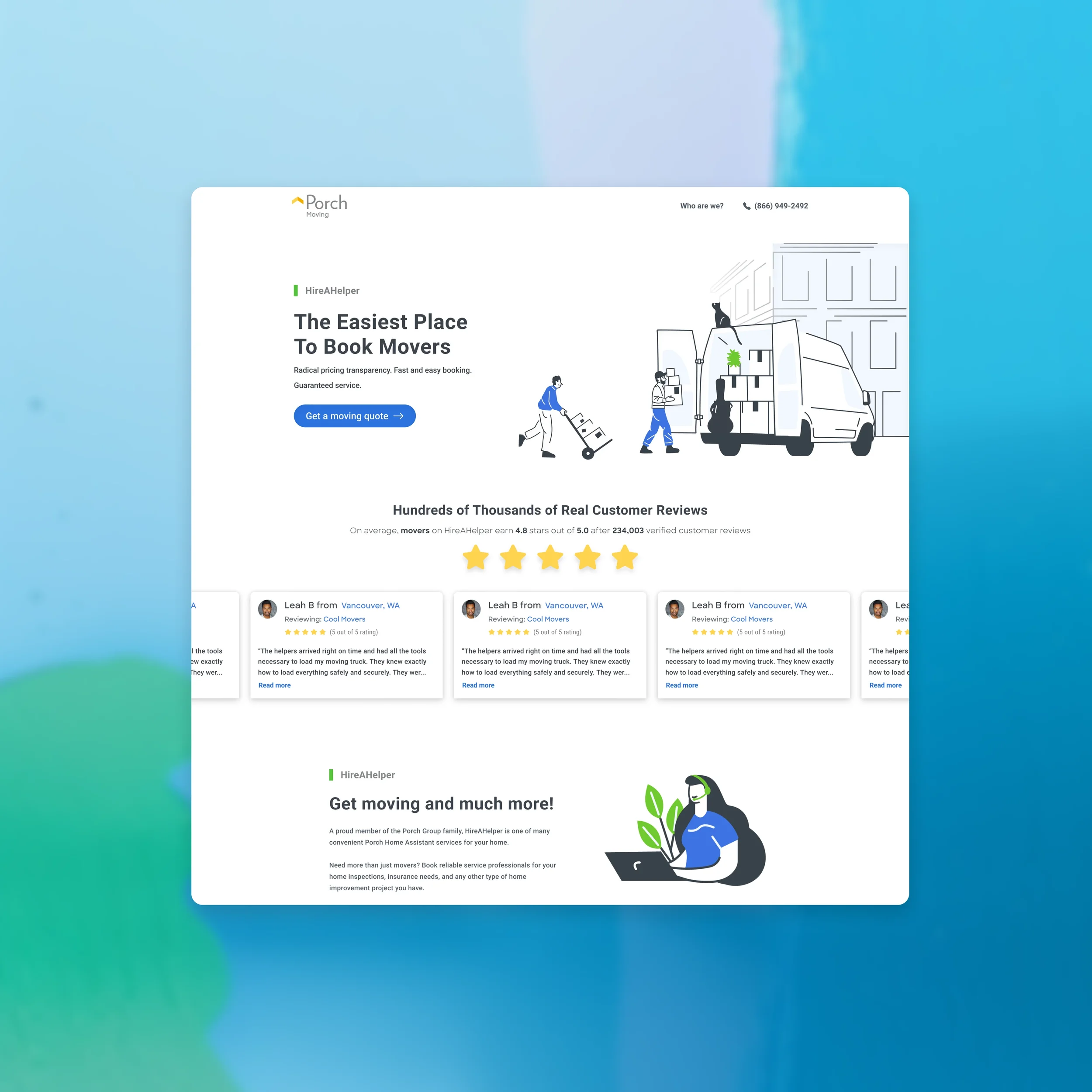
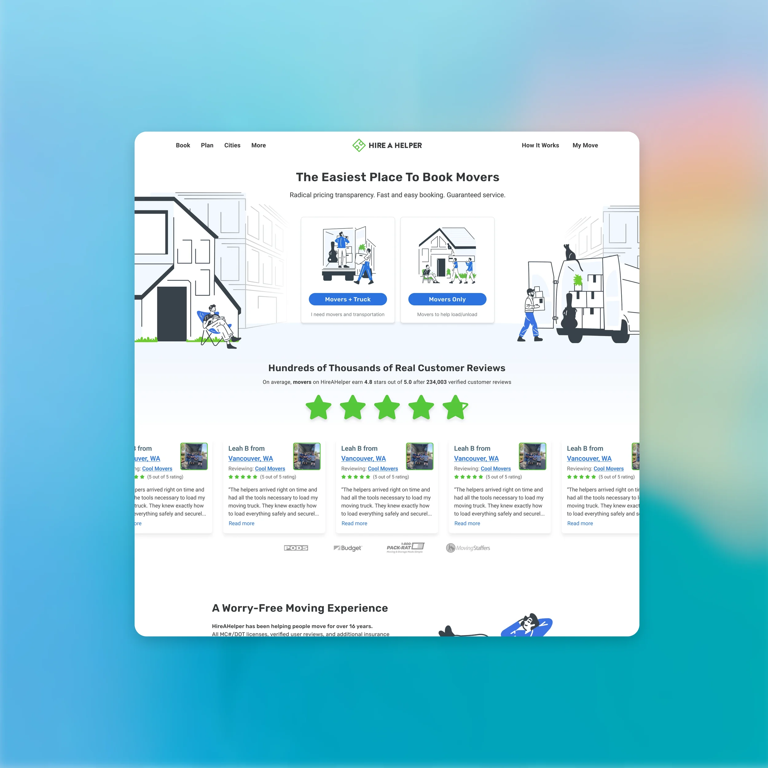
A homepage in this category has one job: reduce uncertainty fast. Users needed to understand the next step in its smallest form for immediate action. All in all these are simple and even obvious concepts but they are critical.
What Porch / HireAHelper is.
Whether it fits their move.
What the next step is.
Why they should trust it.
Design principles
Clarity over clever: value prop first, everything else second
Reduce cognitive load: fewer competing options and a cleaner hierarchy
Fast path to action: obvious CTA placement and tighter above-the-fold messaging
Trust signals that matter: credibility and reassurance without clutter
Visual polish that supports comprehension: aesthetics in service of clarity
Key changes
You can align these to your visuals:
Rebuilt the above-the-fold layout around a single, clean value prop
Simplified navigation and reduced competing paths
Strengthened the CTA structure to funnel users into the next step
Added or re-ordered trust signals to support decision-making
Improved spacing, hierarchy, and scanning patterns to match modern UX standards

Outcome
200% increase in consumer intent
Meaningful increase in funnel entries and purchase-start events
Clearer positioning that made downstream funnel performance stronger because users arrived with better expectations